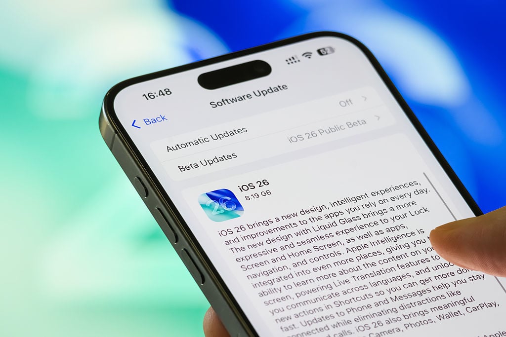
Plenty of folks around the world jumped at the chance to download iOS 26 and try out all the new features, but some people are having buyer’s remorse.
The latest iPhone operating system update from Apple has ruffled some feathers online due to the way Dark Mode looks on the home screen now, per Mac Observer and Reddit. Specifically, users are complaining about a new “tilted” look that apps use in Dark Mode, in which one corner of the app icon has a soft glow around it. The idea here, ostensibly, is to make the icons stand out from the background, but users on Reddit are complaining that it’s distracting and even causing dizziness by looking at it.
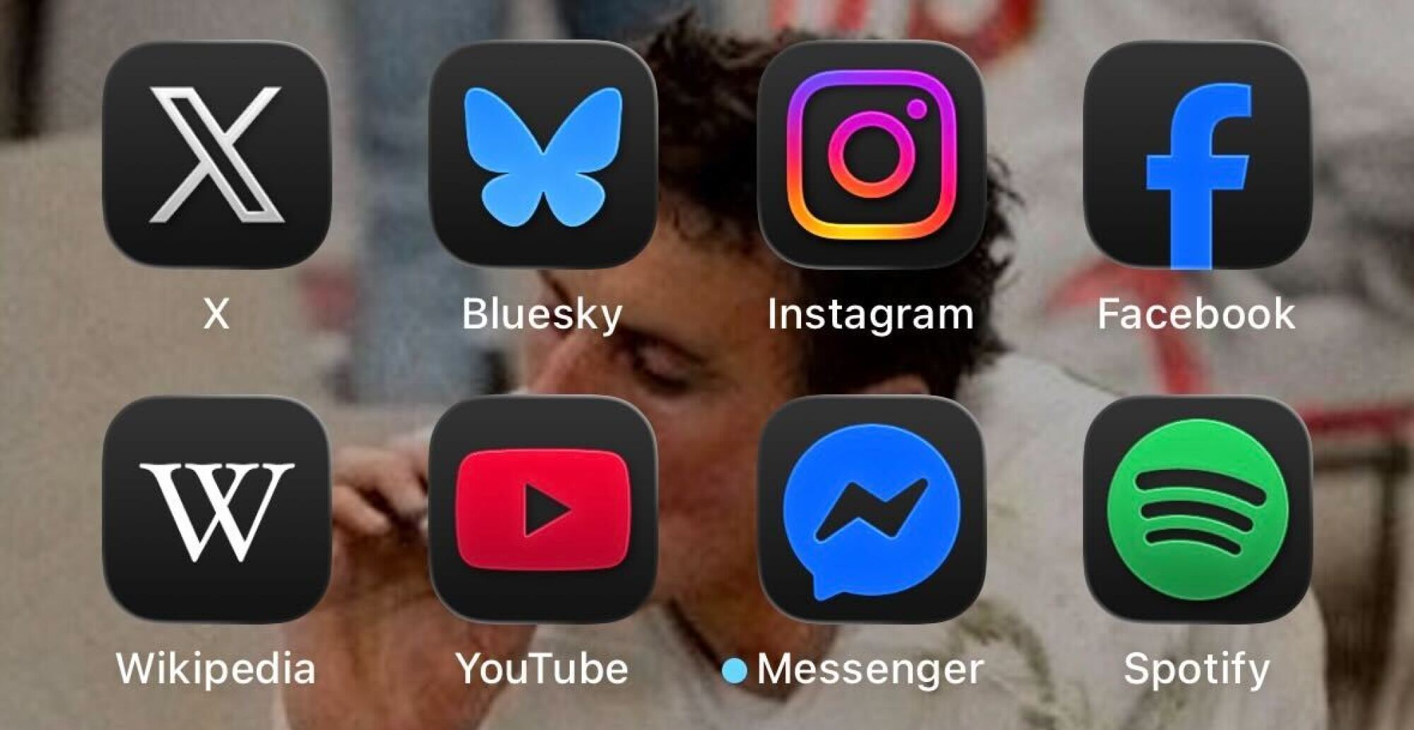
Credit: Screenshot: Apple/Alex Perry
It doesn’t help matters that switching between dark and light modes is a bit weird, as it’s not something you do in the iPhone’s Settings app. Rather, you long press on the home screen, hit “Edit” in the upper left, and then hit “Customize” to choose which theme you want to use. I had to figure this out in the process of writing this article, so I figured it might help someone who is reading it, too.
Your mileage may vary on this particular issue. I don’t find the Dark Mode apps particularly distracting to my eyes, but they’re also my eyes. Other people are clearly having problems with this, so it will be interesting to see if Apple issues a fix of any kind in the near future. In the meantime, you may want to just try one of the other themes and see if that works better for you.