Google’s got a new icon — though you do have to look hard to notice it.
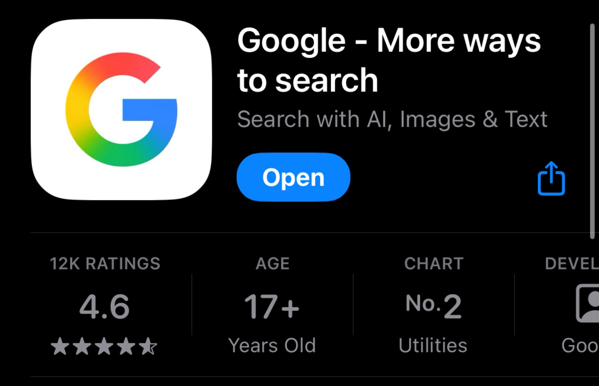
The company started updating the icon on its apps, starting with Google Search on iOS (as noticed by 9to5Google), as well as Google on Android.
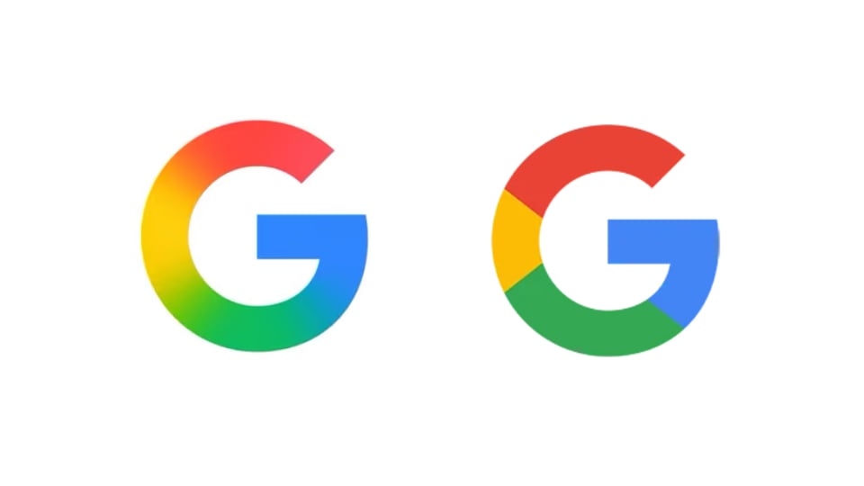
The “G” in the icon still consists of red, yellow, green, and blue colors, and still has the same shape, but the colors now blend into each other, making the logo look a bit smoother and, perhaps, more modern.
Credit: Stan Schroeder/Mashable
Given the change, it’s reasonable to expect other Google logos and icons to change in a similar fashion, but so far it hasn’t happened. Also, the company is still using the old “G” icon in many places, including in the Google Search favicon on the web, and its Google Search blog. Google’s official repository of company logos hasn’t been updated, either.
The company introduced the colorful “G” icon back in 2015; originally, the “g” was lowercase, and white on a blue background.